SI HALAL — Mobile App UI/UX
A real client project I worked on while at Platon, for Kementerian Agama RI (Kemenag) / BPJPH — redesigning the mobile app that Indonesian business owners use to apply for and manage halal product certification. This page collects the flows, the design system, and the downloadable PDF portfolio.
01 · Overview
SI HALAL is the primary mobile channel of BPJPH (Badan Penyelenggara Jaminan Produk Halal) — the Indonesian agency for halal product assurance. Business owners across Indonesia use it to submit, monitor, and manage the halal certification of their products, from the Self Declare path (targeted at UMK / micro & small businesses) through verification by halal assistants (PPH) and internal BPJPH verifiers.
This case study covers an end-to-end redesign of the core product flows from a UI/UX perspective — 15 mobile app flows plus a reusable design system, across three very different roles sharing one app ecosystem.
02 · Background
SI HALAL sits at the end of a long, formal, government-run certification chain. Because the service is used by the general public as well as by internal staff, the app had to work for people with very different skills and goals.
I worked on this redesign as a UI/UX Designer at Platon, for Kemenag RI / BPJPH. The brief centered on the Self Declare path for micro & small businesses — a multi-stage application that had to be made simple enough for UMK owners with limited digital experience, while still capturing all the compliance data the regulator requires.
03 · Problem
The core challenge wasn't making screens prettier — it was taming complexity across three roles and a long, bureaucratic journey.
- 3 roles, 1 app: business owners, halal assistants (Pendamping PPH), and verifiers each have very different information needs and actions.
- Long Self Declare process: eligibility questionnaire, business-owner data, factory/outlet data, raw materials, products, and a final declaration — easy for UMK users to get lost or drop off midway.
- Long status chain: draft → submitted → verification → LPH → fatwa (decree) → certificate issued. Status had to be shown transparently so business owners stop asking repeatedly.
- Reusable business data: owner data (factories, outlets, halal supervisors, legal aspects) is reused across many forms — it needed a repeatable pattern so users aren't overloaded.
This wasn't just a designer's assumption. The Ombudsman RI officially noted that administrative documents, unclear processing times, and several certification requirements were still considered complicated by business owners (ombudsman.go.id, 2024), and the head of BPJPH's Data & IT Center cited repeated administrative processes as the biggest complaint about the service (GovInsider). These findings are part of why the registration flow needed to be redesigned to feel lighter and easier to understand.
04 · Goals
- One consistent design language for all roles, differentiated by color, icon, and menu structure per context.
- Break the long submission into clear step-by-step flows with progress indicators and back/next options.
- Human-readable status tracking with history and explanations so users understand where their application stands.
- Reusable form components (data cards + Add/Edit/Remove) for repeated data like factories, outlets, and raw materials.
05 · My Role
UI/UX Designer (end-to-end) — from discovery to handoff documentation.
- Discover: studied the halal certification business flow (regular & self declare) and the roles of business owners, PPH assistants, and BPJPH verifiers.
- Define: mapped information architecture and user flows per role, defining critical points (NIB validation, eligibility questionnaire, status tracking).
- Design: designed wireframes through high-fidelity UI in Figma — onboarding, home, multi-step forms, and verification screens — reviewed with Platon's PM and internal stakeholders before Kemenag validation.
- Deliver: after sign-off in validation meetings with Kemenag, documented every flow as tasks in Trello for handoff to the development team, complete with empty, error, and success states.
Tools: Figma, FigJam, Trello.
06 · Research
Research Objective
Understand how the halal certification process (regular & Self Declare) actually works end-to-end — and how each of the three user roles (business owners, PPH assistants, BPJPH verifiers) experiences it — so the redesign could address real workflow constraints, not assumptions.
Research Method
This was a qualitative, stakeholder-driven discovery, grounded in the official government channels:
- Official sources: sehati.halal.go.id (SEHATI Self Declare registration platform), halal.go.id (official BPJPH site), webbl.halal.go.id (LPH/LP3H registration & data system), kemenag.go.id, plus official Kemenag regulation & technical-guideline documents.
- Accredited LPH reference: halal.ptsi.co.id — halal certification services of PT Sucofindo (an accredited Halal Inspection Body).
- Supporting references: video tutorials of the certification process, the Mutu Institute guide on halal certification for foreign products, e-Kabari (assistant PPH registration & training flow), and official socialization materials (PDF).
- Process mapping: broke down the certification chain stage by stage — registration, NIB validation, submission, verification, LPH testing, fatwa (decree), and certificate issuance.
- Stakeholder sessions: walked through the workflow and system constraints with the project stakeholders at Platon, who translate BPJPH's requirements.
- Role analysis: separated the needs, actions, and information requirements of each role — because one platform has to serve three very different users.
This was deliberately not a large-scale quantitative study — the priority at this stage was mapping a complex, formal government workflow correctly before designing anything. Each flow was then broken into its own task in Trello to track progress with the team.
Participants
Discovery sessions were run with the project stakeholders at Platon, who translate BPJPH's requirements. The wider user validation happened later through usability testing with 20 participants (see below).
07 · Key Findings
The discovery surfaced a small set of structural problems that drove the whole design:
- Users at very different skill levels share one platform — the flow had to adapt to the user, not the reverse.
- The Self Declare application is long and easy to abandon without clear progress.
- Status is a long chain that users find opaque — leading to repetitive support questions.
- The same business data is needed again and again across many forms.
08 · Pain Points & Design Implications
User Pain Points
- Getting lost in the form: UMK owners could start a long application and not know how far they were or what came next.
- Drop-off midway: a lengthy, unguided flow makes users likely to abandon before submission.
- Opaque status: in a long chain (draft → … → certificate), users repeatedly asked where their application stood.
- Re-entering the same data: facts like factories and outlets had to be retyped across many forms.
- Risk of approval errors: verifiers reviewing data stage-by-stage lacked a way to approve per section, inviting mass-approval mistakes.
Design Implications
Each finding translated into a concrete design decision — this is the thread that connects research to the final product:
- Finding: three very different roles share one platform → UX problem: one menu can't fit all → Decision: single login with per-role adaptive home menus → Final solution: one shared design language, differentiated by role-specific color, icons, and menu content.
- Finding: the Self Declare application is long and easy to abandon → UX problem: users lose orientation and drop off midway → Decision: split the submission into a guided, step-based form → Final solution: a 7-step form with a visible "Step X of Y" indicator and back/next controls.
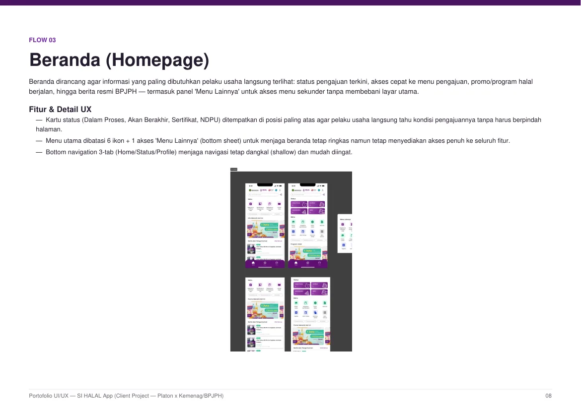
- Finding: status is a long chain users find opaque → UX problem: repeated "where is my application?" questions → Decision: make status a readable timeline, not a single label → Final solution: status summary cards on the home screen plus a status & tracking flow with history.
- Finding: the same business data is retyped across many forms → UX problem: repeated effort and typo-prone input → Decision: build reusable data-entry patterns → Final solution: data cards with Add/Edit/Remove for factories, outlets, halal supervisors, and raw materials, reused across forms and profiles.
Two of these decisions, visible in the final screens — the guided multi-step submission and the transparent status tracking:
09 · User Flow
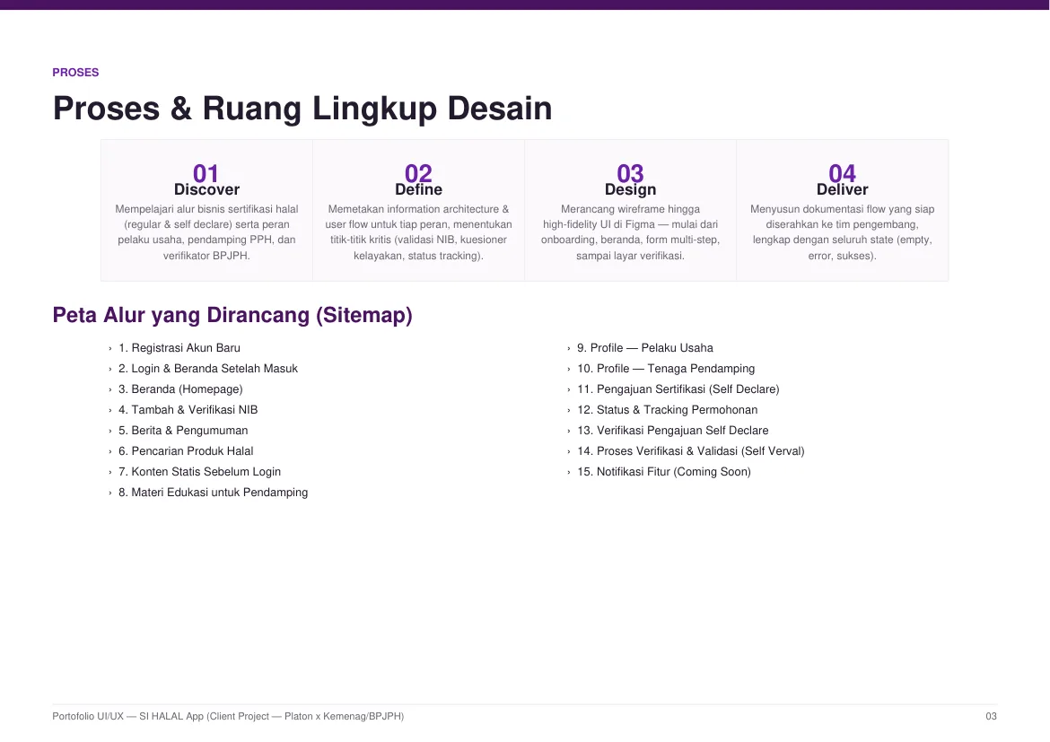
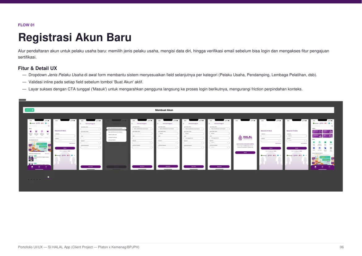
I mapped the information architecture and per-role flows before designing screens. The result was 15 connected flows, from account registration through Advanced verification.
Sitemap — all 15 flows: Account registration · Login & post-login home · Homepage · Add & verify NIB · News & announcements · Halal product search · Static content pre-login · Educational material for assistants · Business-owner profile · Assistant profile · Self Declare submission · Status & tracking · Self Declare verification · Advanced verification (Self Verval) · Coming-soon notifications.
10 · Wireframes
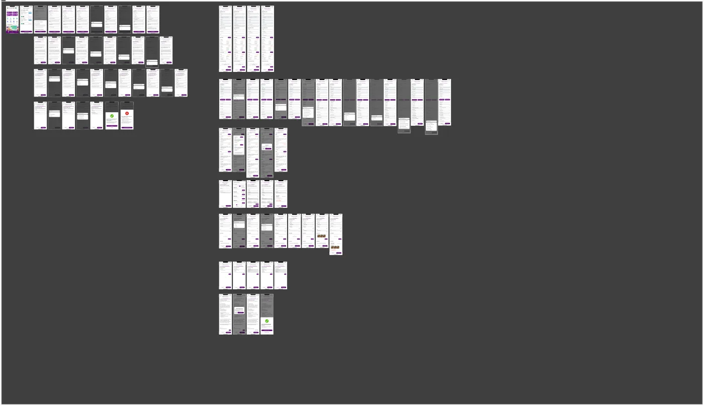
Before any visual design, I translated the 15 flows into low-fidelity wireframes inside Figma. This step let me validate structure cheaply: how many steps each flow really needs, where primary actions sit, how forms break into screens, and how a shared navigation pattern can serve three very different roles. Wireframing first also made the later design-system work faster — every high-fidelity screen was built on an already-agreed structure, so styling decisions never had to fight layout decisions.
11 · UI Design
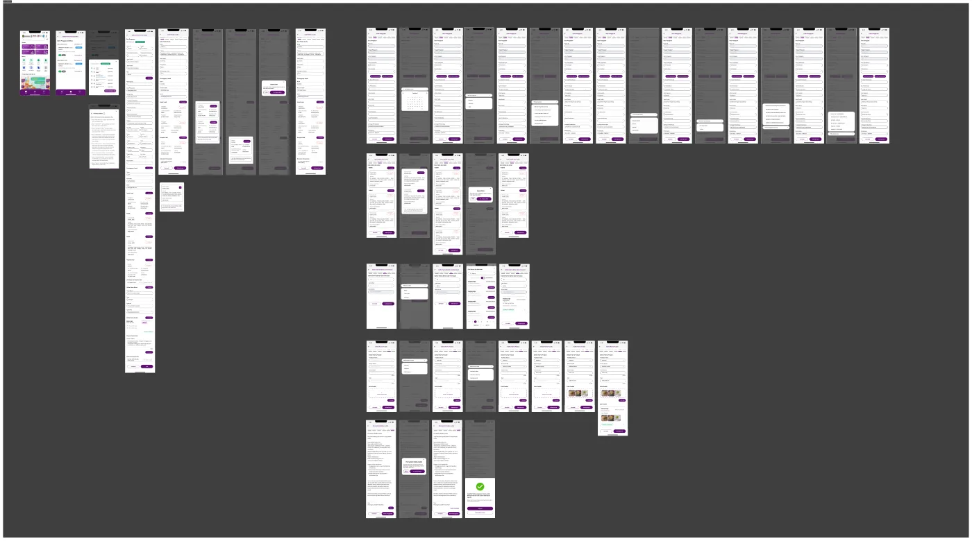
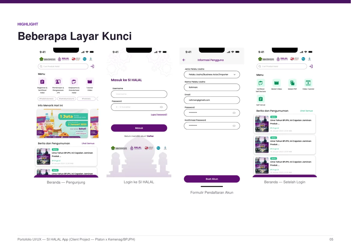
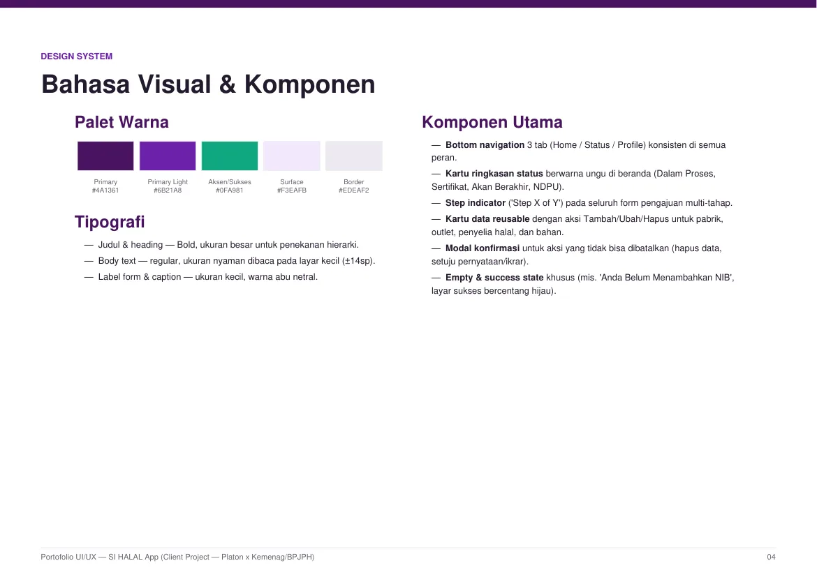
With the structure validated, I moved into high-fidelity UI in Figma. The visual direction had to feel trustworthy and official, since the app supports a government certification process — while remaining friendly and approachable for users with lower digital literacy. A deep purple palette (#4A1361) anchored the official, institutional tone, with green reserved for success and certificate states so positive outcomes are instantly recognizable. Type was kept bold for hierarchy and readable (~14sp) for small screens, and every role shares one visual language, differentiated only by color, icon, and menu content.
12 · Design System
To keep 15+ flows consistent, I built a component-based design system: typography scale, color tokens, buttons, form fields, status indicators, and reusable patterns for each user role. This kept the screens consistent, sped up iteration, and made handoff to developers much clearer.
13 · Prototype
I connected the final screens into an interactive prototype in Figma, covering the core journeys end-to-end: onboarding, self-declaration, verification, and status tracking. The prototype was used for internal review and became the basis for usability testing.
14 · Usability Testing
Before the design was handed off to the development team, I validated it through usability testing with 20 participants — a mix of business owners (UMK) and PPH assistants — using the interactive Figma prototype. Participants walked through the self-declaration and verification flows, where the burden of correct data entry is highest.
The baseline finding before the redesign was consistent: business owners were often confused about which stage of the overall process they were in — from product registration through verification — because there were no clear status or progress markers. After the redesign, the step indicator on multi-stage forms and the explicit Status & Tracking page made the journey clear and easy to follow for the test participants — contributing to a +25% improvement in usability score compared to the previous version. The reviews also pointed at the same class of issue: orientation. Those observations fed directly into the iteration round below.
15 · Iteration
Findings from the reviews fed directly back into the design with concrete structural changes:
- Long forms became guided steps. The Self Declare submission was split into a 7-step form with a visible "Step X of Y" indicator and back/next controls — so users always know where they are and how much is left.
- Repeated data became reusable blocks. Factories, outlets, halal supervisors, and raw materials turned into data cards with Add/Edit/Remove — entered once, reused across forms.
- Status became a story, not a label. A status timeline with history replaced a single opaque state, answering "where is my application?" without support channels.
- Empty and error states got designed. Specific messages like "The NIB you entered is wrong" appear under the field, and empty states ("You haven't added a NIB") tell users exactly what to do next — replacing generic alerts.
- Irreversible actions gained confirmation modals — deleting data or accepting a declaration can't happen by accident.
16 · Final Solution
The final product is a mobile app that guides three different user roles through one coherent system: a clear entry point for each role, a self-declaration flow broken into manageable steps, visible status tracking for the certification process, and a consistent component library across all 15 flows. The complete design package — flows, design system, prototype, and full UI-state documentation — was handed off to the development team as the reference for build.
17 · Outcome
The project delivered a complete, developer-ready design for the SI HALAL mobile app: 15 connected flows covering the certification journey from onboarding to status tracking, a full component-based design system, and an interactive prototype. Every flow shipped with documentation of all UI states — empty, error, and success — so the development team could implement without guessing. The design was validated through usability testing with 20 participants, showing a +25% improvement in usability score, before being handed off to the engineering team as the reference for build.
18 · Reflection
Designing for a government certification process taught me how much clarity matters when users face a high-stakes, unfamiliar flow — and how differently the same product is experienced depending on a user's digital literacy. Designing for three roles in one system also reinforced that consistency isn't about sameness: the strongest solution was one shared design language with deliberate per-role variation, not three separate products. The +25% usability-score improvement from testing proved that the step-by-step approach and explicit status tracking genuinely helped users — not just a design assumption.
If I could push this further, I would expand usability testing to a larger, more diverse sample (across digital-literacy levels and regions) to validate whether the 7-step submission stays light for every segment, and explore offline support and push notifications for status changes.
— Fegi Sucepto Priawan · UI/UX Designer